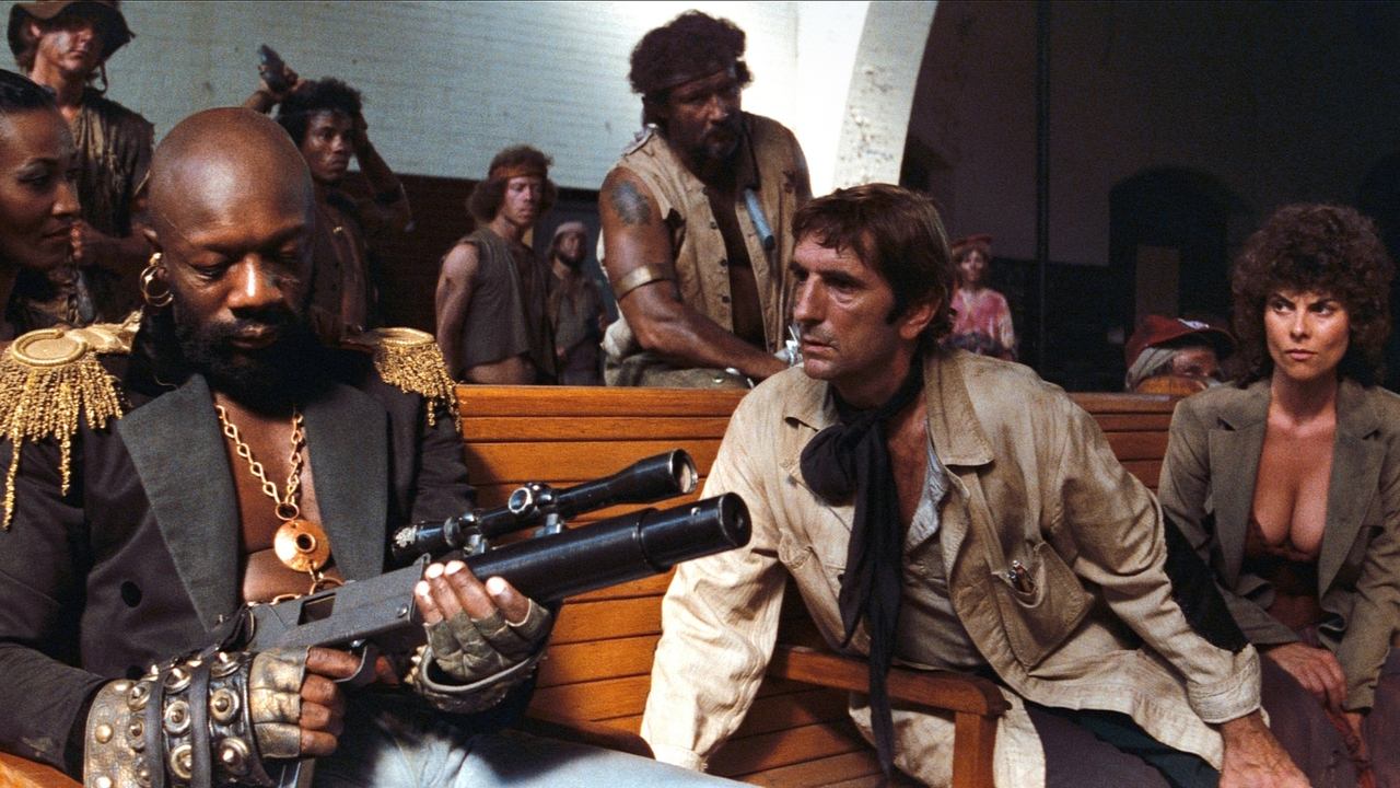
"Too little of too much" would describe this movie well, which presented us a dystopian New York with development potential and characters whose background is shared, exposed with brief moments of characterization that made me feel like I was missing this movie's predecessor. It didn't exist, and so the end result was of an expanded universe of unknown circumstances - except for the brief introduction we got in the opening credits - where the events barely told the story during the time it was running. But where this movie failed in terms of script, it almost made up with atmosphere and music. It sounds great throughout, but the credit goes to the opening theme that is as minimal as the presentation is grounded, in that humble approach of whom ambition wasn't unheard. Sadly, it's not the case of a classic whose production values challenge the computer generated visuals of today (and ironically this movie's novelty was the wireframe view), but if you're interested in history and want to make a contextual analysis, you may find something worth treasuring.
When authors create they sign. When editors hack they design.
